Create visualizations
datasight can create any chart type that Plotly.js supports. Just describe what you want in plain English.
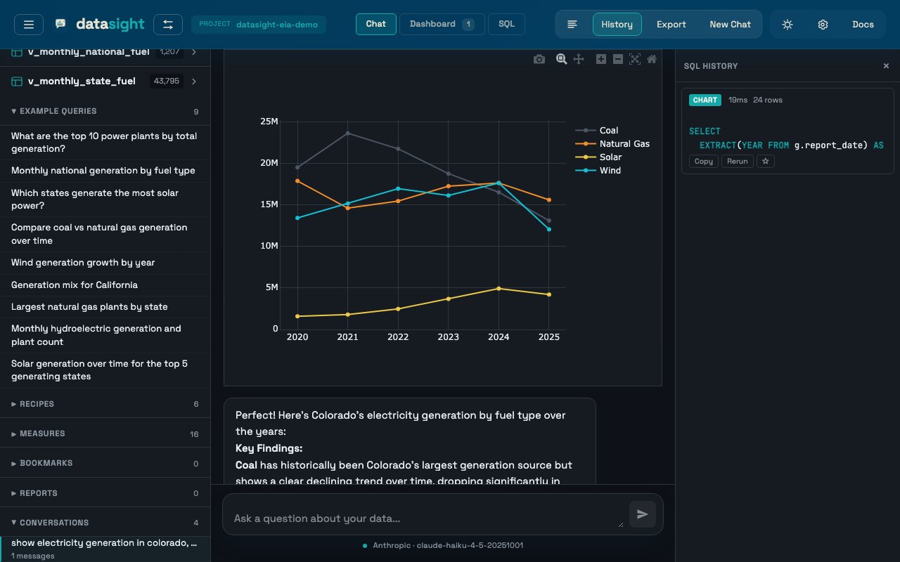
Basic charts
For standard visualizations, simply ask:
- "Show monthly generation as a bar chart"
- "Plot wind output over time as a line chart"
- "Create a pie chart of generation by fuel type"
The AI writes a SQL query, fetches the data, and builds a Plotly chart with the appropriate trace type, axis labels, and colors.
Geographic maps
datasight supports choropleth maps and scatter maps for geographic data. If your data includes state codes, country codes, or coordinates, you can ask:
- "Show power generation by state on a US map"
- "Map average temperature by country"
- "Plot plant locations on a map using latitude and longitude"
The AI will use Plotly's choropleth or scattergeo trace types and
configure the appropriate geographic scope and projection.
Advanced chart types
Beyond the basics, you can request any Plotly.js chart type:
| Chart type | Example prompt |
|---|---|
| Treemap | "Show file sizes as a treemap grouped by directory" |
| Sunburst | "Create a sunburst chart of generation by state and fuel type" |
| Sankey diagram | "Show the flow of energy from source to sector as a sankey diagram" |
| Waterfall | "Show monthly generation changes as a waterfall chart" |
| Funnel | "Create a funnel chart of capacity by development stage" |
| 3D scatter | "Plot height, weight, and age as a 3D scatter plot" |
| Parallel coordinates | "Compare all numeric columns using parallel coordinates" |
| Candlestick | "Show daily stock price as a candlestick chart" |
| Violin | "Compare score distributions by group using violin plots" |
| Heatmap | "Create a heatmap of correlations between numeric columns" |
Trendlines and linear regression
When you ask about a trend, rate of change, or correlation between two numeric variables, the AI fits a linear regression and overlays the fit line on the chart. Example prompts:
- "Is net generation trending up for natural gas plants?"
- "What's the relationship between capacity factor and plant age?"
- "Plot monthly coal generation with a trendline"
The chart will show the raw points plus a dashed trend line, and the written answer will quote the slope, intercept, and R² of the fit. R² is interpreted honestly:
- R² < 0.3 — weak fit; the trend is not predictive
- R² 0.3–0.7 — moderate fit
- R² > 0.7 — strong fit
On DuckDB and PostgreSQL, the AI uses the built-in regr_slope,
regr_intercept, regr_r2, and corr aggregates. SQLite has no built-in
regression functions, so the AI computes slope and intercept manually — this
works but is slower on large tables.
How it works
When you ask for a visualization, the AI:
- Writes a SQL query to fetch the relevant data
- Constructs a Plotly.js specification with trace objects and layout configuration
- The backend executes the SQL, maps column names in the spec to actual data arrays, and renders the chart in an interactive iframe
Because the AI builds the Plotly spec directly, it has access to the full Plotly.js API -- any trace type, layout option, or configuration that Plotly supports.
Customize charts in the UI
Once a chart is rendered, you can modify it directly using the toolbar at the top of the chart iframe:
- Chart type — switch between bar, line, scatter, and pie using the dropdown. Data is automatically remapped (e.g. pie labels become bar x-axis values).
- Title and axis labels — edit the chart title, x-axis, and y-axis labels using the text inputs.
- Save spec — click the download icon to save the Plotly JSON specification. This is useful for embedding charts in Jupyter notebooks or other tools.
Open the controls by clicking the gear icon (⚙) in the chart toolbar.
Tips for better visualizations
Be specific about the chart type. "Show generation by month" will work, but "Show generation by month as a stacked area chart grouped by fuel type" gives the AI more to work with.
Name your columns clearly in SQL. The AI maps column names from the query
results into the Plotly spec. Aliases like total_mwh or state_code are
easier for the AI to place correctly than ambiguous names.
Ask for refinements. After a chart is rendered, you can follow up: "Make it a horizontal bar chart instead", "Add a title", or "Use a log scale on the y-axis."
Keep result sets reasonable. A choropleth of 50 US states works great. A scatter plot of 10 million rows will be slow. If your dataset is large, ask the AI to aggregate before visualizing.