Build a dashboard
The dashboard collects pinned results from your chat session into a responsive grid you can filter, annotate, and export as a standalone HTML page.
Pin results
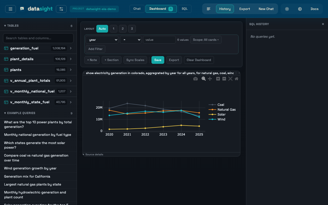
Every result card (table or chart) has a Pin button on hover. Clicking it copies the result to the dashboard.
Switch between Chat and Dashboard using the tabs in the header. The dashboard tab shows a badge with the pinned item count. Each pinned card has an Unpin button.
Pinned items persist while you work in a session. Clicking New Chat clears the dashboard and starts a fresh working session.
Apply dashboard filters
Pinned tables and charts keep the SQL and chart specification needed to rerun the card. The dashboard toolbar can apply result-column filters across pinned cards, for example:
state = CAenergy_source_code = WNDreport_year >= 2020plant_name contains solar
Choose a result column from the dropdown, an operator, then a suggested value or type a value manually. Value suggestions come from the existing pinned results and are capped at 100 options. The column dropdown lists every column that appears on any pinned card with saved SQL — a filter only runs against cards that actually contain the column, so you do not have to restrict yourself to columns shared across the whole dashboard.
Active filters appear as chips in the toolbar. Each chip shows the column, operator, value, and the number of cards the filter applies to. Click the chip label to open a scope menu:
- Enabled — uncheck to keep the chip around but exclude it from reruns. Disabled chips render muted and strikethrough.
- All applicable cards (default) — applies the filter to every pinned card that has the column.
- Selected cards — pick the specific cards the filter should apply to. Other cards rerun unfiltered.
Cards that the filter does not apply to show a small "filter not
applied" badge in the card header, with a tooltip explaining why (the
column is missing, or scope excludes the card). Cards that rerun with
zero rows show a No rows after filter overlay, and cards whose
rerun fails show a Rerun failed overlay with the error message.
Click the × on a chip to remove it, or click Clear Filters to
rerun the dashboard without filters.
You can also click a chart mark to apply a filter when datasight can map the clicked value back to a result column — this works best for charts where the x-axis or labels come directly from a result column (generation by state, generation by fuel type, annual generation by report year).
Post-aggregation filters
Dashboard filters wrap the saved card SQL and filter the result set.
This is deterministic and works well for categories already present in
a card, but it is not the same as adding a WHERE clause before
aggregation. Filtering a chart that has already grouped rows by state
filters the grouped state rows; it does not change the pre-aggregation
population unless that filter column is present in the grouped result.
Add notes and sections
The dashboard is not limited to pinned tables and charts. You can also add:
- Notes — short markdown commentary between cards
- Sections — headings and short intros that group the cards that follow
Use the dashboard toolbar to add them, or use the insert controls between cards. This makes exports read like analysis documents instead of a loose grid of results.
Arrange the layout
The dashboard toolbar lets you choose a column layout:
- Auto — responsive grid that fills available space
- 1 / 2 / 3 — fixed column count
Drag cards by their handle (visible on hover) to reorder them. Charts automatically resize when the layout changes.
The toolbar also supports Sync scales for chart comparison.
Export the dashboard
Click Export dashboard in the toolbar to download a standalone HTML page with all cards, notes, sections, SQL, and interactive charts. If the dashboard has any active filters, a chip strip at the top of the exported page lists each filter (column, operator, value, and scope when it targets specific cards) so viewers can see how the data was filtered. Card contents reflect the post-filter results.